iOttie Packaging Redesign
Here, you can write a brief introduction to your page. This engages your visitors and answers questions they may have about you.
̌
iOttie Packaging Redesign
iOttie is a leading mobile accessories company based in NYC that produces wireless charging solutions, car mounts, and outdoor products that are engineered to enhance the smartphone user’s experience.
After acquiring partnerships with leading retailers (Best Buy, Target, Sam’s Club, etc.) there was a need to create a new line of packaging for the company’s home products and to redesign the current packaging for automotive products to reflect the quality and higher price point of iOttie’s award winning line up. This project required a design that would balance the product designer’s desire for minimalism and the business development team’s desire to call out every feature with big bold visuals/messaging.
BEFORE
AFTER
While working closely with the industrial design team I saw the process of taking a product that only considered mechanics and transforming it into something that married form and function. My goal was to highlight the new and improved design of iOttie’s products by singling them out and to communicate their function with messaging, iconography, and strategic lifestyle imagery.
ION WIRELESS: A NEW MARKET
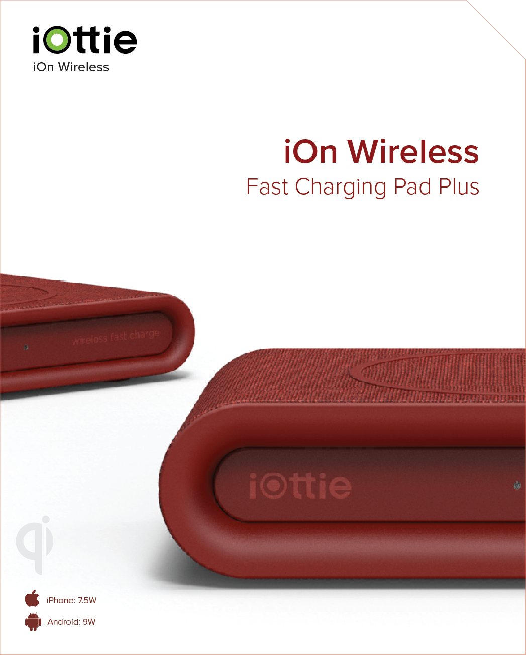
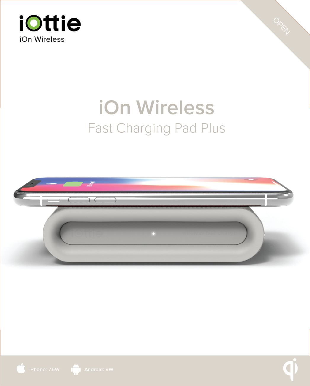
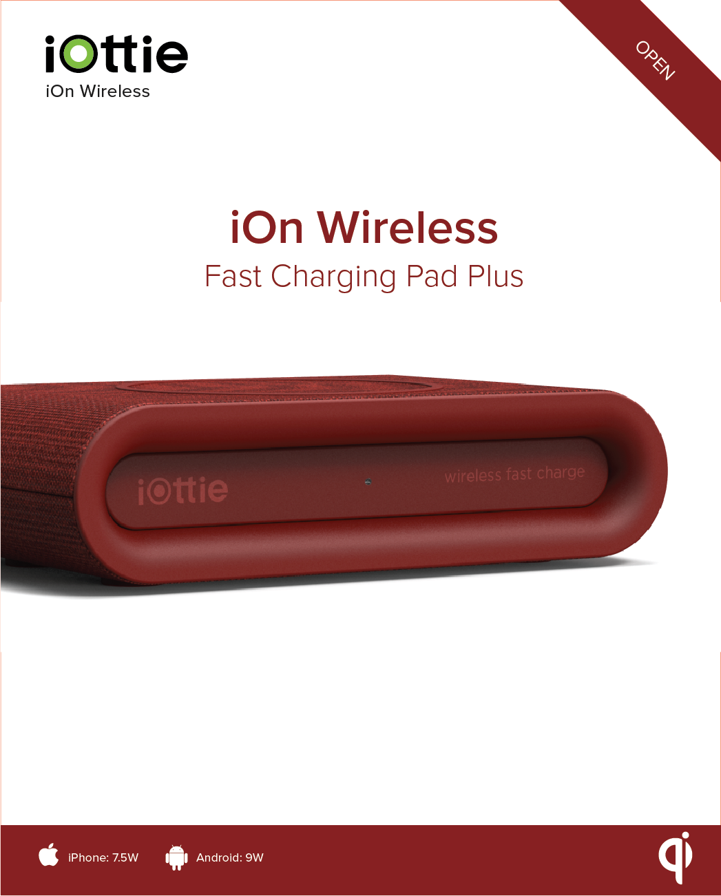
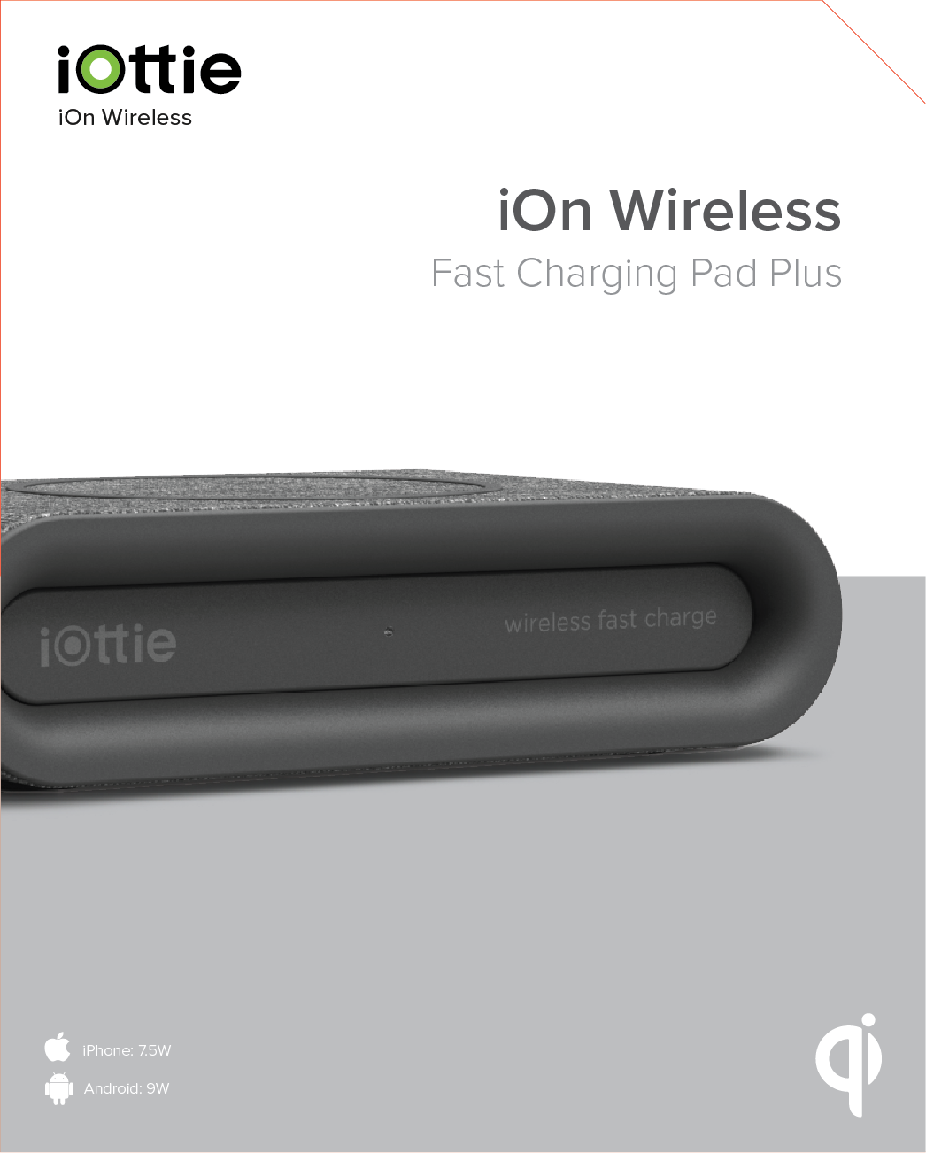
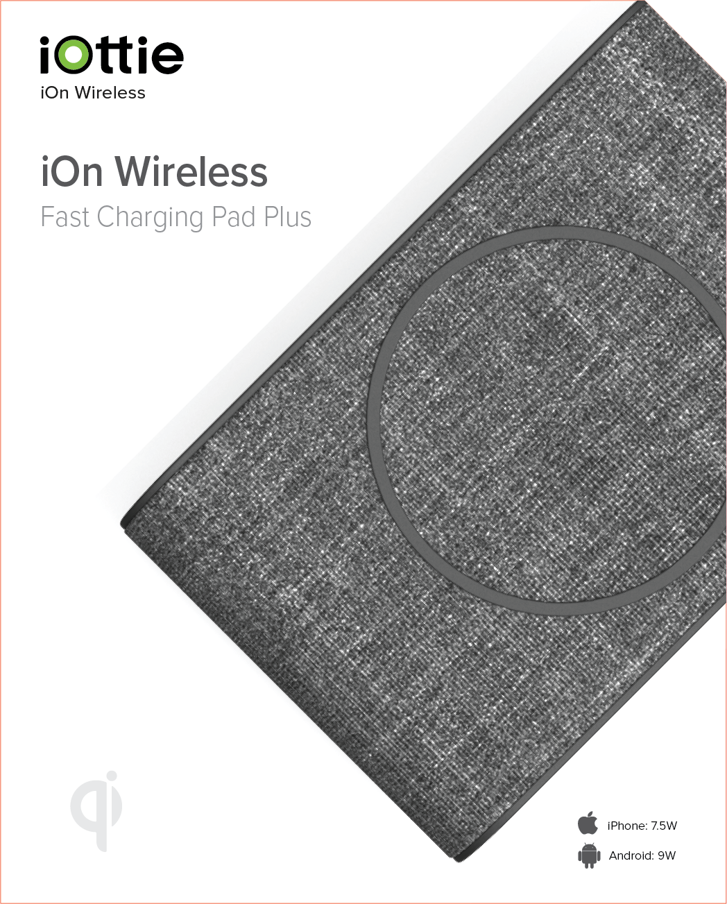
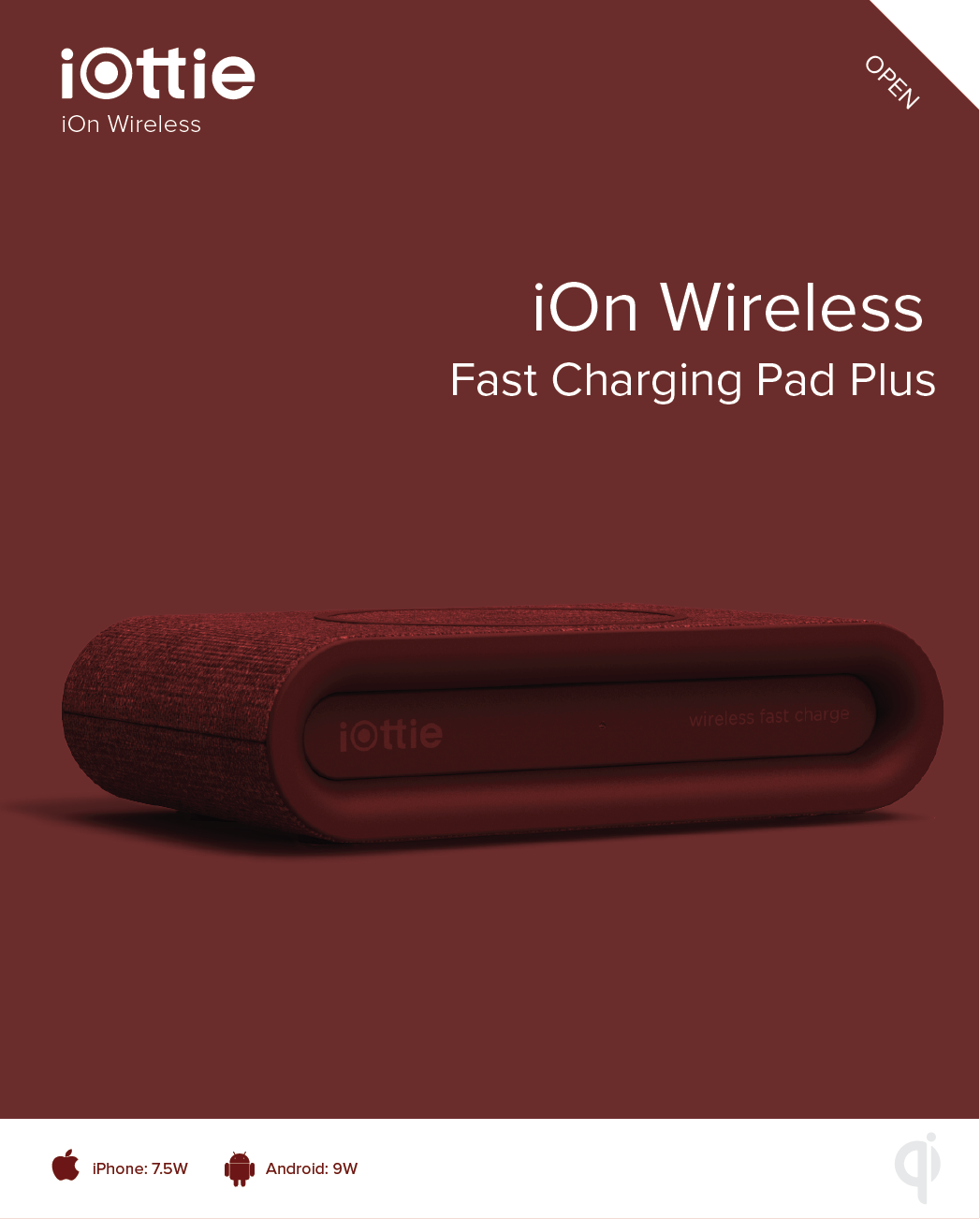
The iON Wireless Series represents iOttie’s first entry into the home electronics market. For the final iON series packaging we chose to prioritize simplicity and product focused visuals. We moved the green color blocking to the bottom of the packaging to separate iOttie from more well known brands in the home mobile accessories market that used a similar brand color in their packaging (i.e. Belkin) and used a white background to highlight the product’s color and position ourselves as separate from the all black packaging of brands like Schosche and Samsung.
process


